With the reverse retro jerseys returning for 2022-23, here are a few designs we want to see:
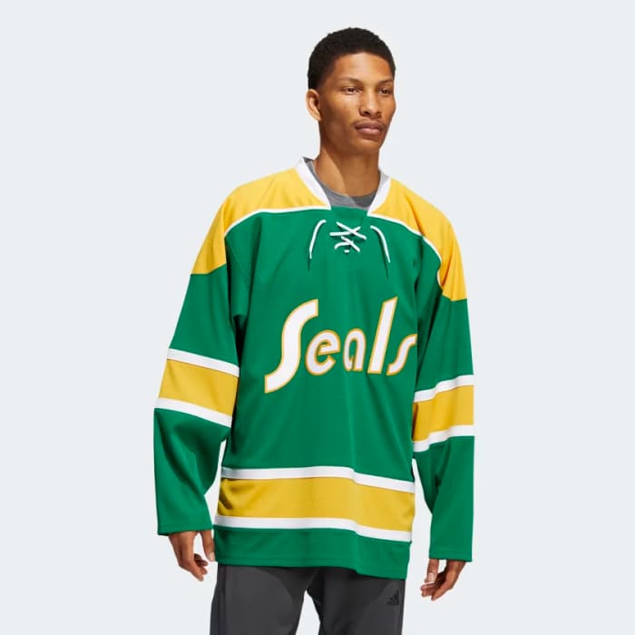
The California Golden Seals Or The Cleveland Barons Gaining New Life
Once upon a time, you didn’t see NHL teams wearing jerseys from their past after a relocation or merger. Thankfully, that has changed over the past few seasons.
The Colorado Avalanche’s first reverse retros was a twist on the Quebec Nordiques look, while the Carolina Hurricanes have paid homage to the Hartford Whalers on a few occasions.
It feels like it’s time for someone to finally bring back the look of either the Golden Seals or the Barons in a reverse retro.
But who’ll do it?
Both the San Jose Sharks and the Dallas Stars could give it a go, as both have connections to the Golden Seals/Barons franchise. Dallas has the most known connection going back to when the then struggling Minnesota North Stars merged with the also struggling Cleveland Barons before the 1978-79 season.
The Sharks have given away Seals shirts and worked to promote their history as the NHL’s first Bay Area franchise.
With the Sharks acknowledging the history and the regional connections, it would be more likely for them to wear something showcasing their history at the SAP Center. It would follow the regional trends of the Avalanche wearing Colorado Rockies-inspired jerseys and the Minnesota Wild wearing…wait for it, Minnesota North Star-themed reverse retros.
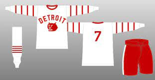
The Red Wings To Return To the Detroit Cougars Logo
Among the first batch of reverse retros, a few stood out for how good they were, while others stood out for how underwhelming they were. Detroit fell into the latter. The jerseys looked very plain, and social media let it be known how they felt about a uniform that regularly polled among the league’s worst in 2020-21.
Regarding what the team should do next, it’s time for the Wings to dig into a look they’ve yet to revive. Forget making a Detroit Falcons reverse retro or just using the Old English D letter on the front of a jersey, it’s time for the Red Wings to use an image that they haven’t worn since 1928-29.
The Wings haven’t worn the cougar head logo of their original identity in any throwback jersey, and keeping up with the reverse theme with the red cougar logo turned white on a red jersey would be a refreshing change. An updated twist on the cartoon cat is long overdue.
Keeping The Black Jerseys To A Minimum
One of the best parts of the original reverse retro program was the variety of colors that came from it. Various teams wore purple, yellow, green, orange, and red jerseys. The only teams that went with jerseys that had a black base were Calgary and Chicago.
We’ve only had one jersey leak out so far. Still, hopefully, colorful jerseys continue to be the plan as opposed to the heavy usage of black as a default alternate look which has been a common trend in pro sports over the years.
The Winnipeg Jets meet Atlanta Thrashers
Much like Detroit’s, the original reverse retros of the Winnipeg Jets left much to be desired, from the design looking incredibly plain to the jersey base being grey. The Jets have borrowed from the original NHL franchise to call Manitoba home multiple times, but throwing it back to where Jets 2.0 moved from would be an unexpected callback.
It would be fun to have a baby blue Jets jersey with the WINNIPEG letters running down the sleeves, a tribute to the uniform that doubled as both alternates and eventually their home uniforms from 2003-11 for Atlanta.
Or a revival of the Thrashers logo in modern Winnipeg colors would be another welcome spin for the uniform.


