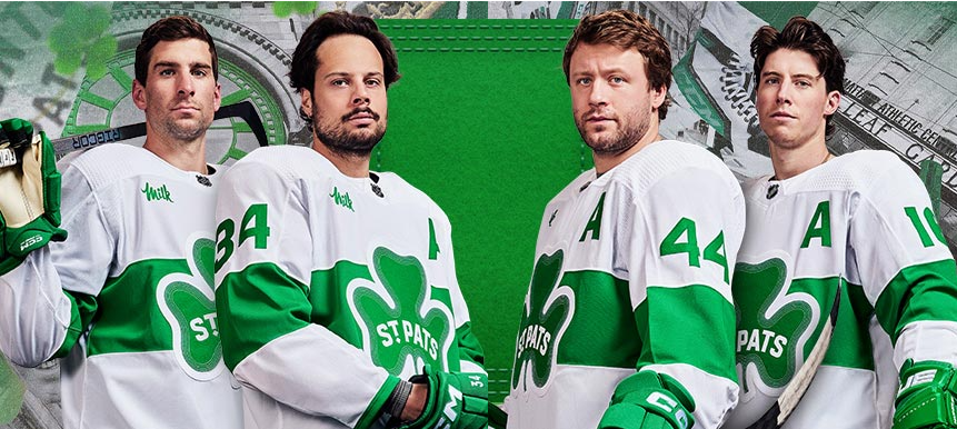
The Maple Leafs brought back their St. Pats jerseys back in 2017 and while the return of an additional specialty jersey for the Leafs is positive thing, the fact that the jerseys were white with a wordmark logo always seemed to leave fans wanting more.
Just over a month ago Icethetics teased that the Leafs would be unveiling a new design this season and that it would include a logo instead of a wordmark. This is also the last new jersey released by Adidas before they ride off into the sunset leaving the NHL in the hands of Fanatics, a decision that is already working out beautifully for Major League Baseball.
Anyways, I’m straying from the point so here is the jersey unveil from the Maple Leafs featuring Sarah Nurse:
These got us greening from ear to ear ☘️
03.16.24 pic.twitter.com/x4js0zyzAt
— Toronto Maple Leafs (@MapleLeafs) March 11, 2024
Better look at it:
So it’s time for a little pass/fail when it comes to the St. Pats jersey and immediately, I will express my confusion over not going with a four-leaf clover, you know that thing that is most closely associated with St. Patrick’s Day, and something that is supposed to bring you luck. Is the narrative supposed to be that the Leafs are unlucky or that they are trying to make their own luck? Either way, I think four-leafs would have been the way to go as it would have also resulted in better centering of the wordmark that seems out of line with the jersey stripe and makes things look a little off.
Since I started with complaints rather than positives, I’ll stick with my last two issues and that is I would have loved a Maple Leafs logo shoulder path or the shamrock/Maple Leaf combo that the Leafs use to promote their St. Pats line on the Real Sports website. The pop up blue would make the jersey standout.
And finally, why can’t we get a green jersey instead of a white one? This might just be me speaking on behalf of slobs everywhere but if I’m spending $300 on a limited run jersey, I’d prefer not to have wing sauce or mustard show up on it. Won’t somebody please think of the messy eaters?
Onto the positives, I’ve always appreciated when the Leafs are willing to briefly step away from the blue and white and do something a little different and while I’ve complained about the shamrock a little, having a logo instead of the boring St. Pats wordmark is a step in the right direction and make these jerseys a win for the Leafs.

I’d say I’d be more likely to buy the St. Pats t-shirt over the jersey but given that it is made by Fanatics and costs $40 that seems like a lot to spend on something that you will wear uncomfortably once before it shrinks to half its size, and you give it to a small child in your life. Maybe I’ll buy the $12 keychain instead.
The Leafs will wear these jerseys for their home game against the Hurricanes on Saturday night (March 16th) and if we are truly lucky the Canes will wear their Whalers alternates for a double dose of green. (The Canes jersey schedule has them wearing whites which no longer makes sense given that Toronto will be wearing white.)
Now that I, an over the hill dude who is presently wearing a plaid flannel shirt for the fourth time in as many days has weighed in on fashion design, I’ll turn it over to you. Do these jerseys get a pass or a fail from you.

Was it a legal hit? Will the NHL hand out a suspension? How does the appeal process work? Who is the heavyweight champ? Every Tuesday, Ryan Pinder & former NHLer Jay Rosehill are in your Department of Discipline. Tune in to catch their takes on some of the most scrutinized parts of hockey. Check it out and subscribe to catch the latest episodes!


