The latest crop of the NHL’s reverse retro jerseys have officially been released.
Let’s take a look at how all 32 of them stack up by ranking them in tiers.
Elite Tier
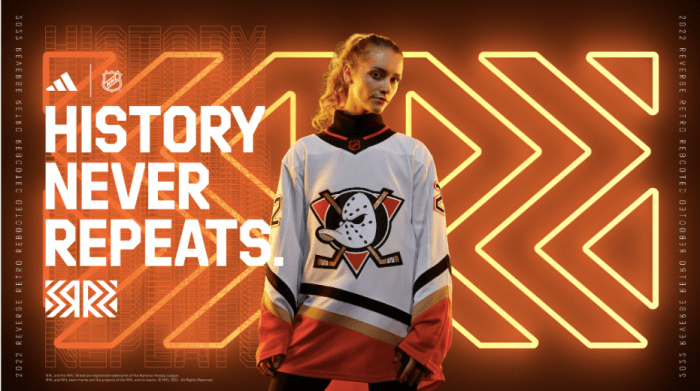
Anaheim Ducks
It makes me genuinely furious that these aren’t the Ducks’ primary jerseys. There is no reason why they shouldn’t be, really, with the color palette and logo perfectly embodying the sense of fun that the organization, led by Trevor Zegras, is going for.
I can’t write about these anymore because it might ruin my day.
They’re great. Make the right choice, Anaheim.
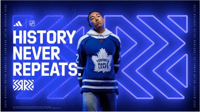
Toronto Maple Leafs
After trotting out one of the worst reverse retros designs in 2021, the Maple Leafs have redeemed themselves this time around by creating one of the best.
Everything about the jersey works. The crisp logo. The white shoulders. The font and textured felt feel of the Maple Leaf. It’s enough to make one wonder just how on earth the club decided to go all in on grey in their last iteration.
It’s water under the bridge, because these babies are top notch.
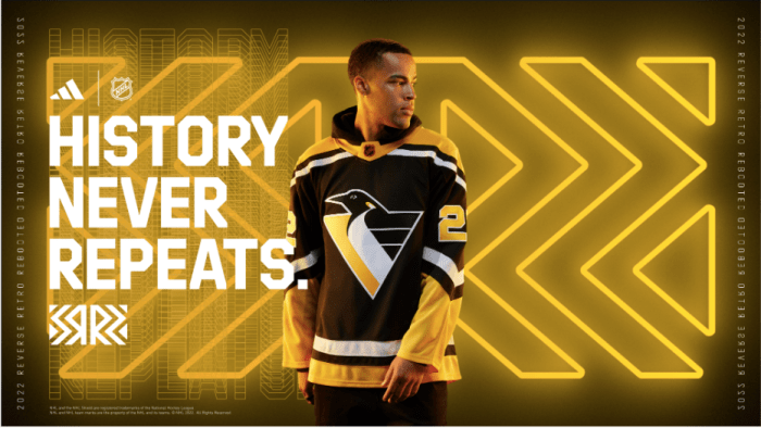
Pittsburgh Penguins
Something about these jerseys just feels right. Not only did this era of Penguins hockey feature the rise of Jaromir Jagr, but the jerseys themselves are clean as heck too, capturing the “retro” vibe perfectly while still holding up to modern standards with the updated yellow and black color scheme.
It’s only right that Jagr, Mario Lemieux, and now Sidney Crosby will have each worn this jersey in official game action. And for that alone, this earns an elite nod.
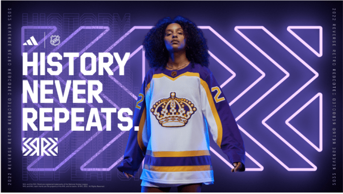
Los Angeles Kings
The purple and gold is such a cheat code for the Kings. It’s the perfect color palette, with the team able to dip into one of the best overall jersey designs the sport has ever seen whenever an alternate is required and come out with a top-tier product.
That’s what happened here. Just a fantastic creation that is soothing to the eyes.
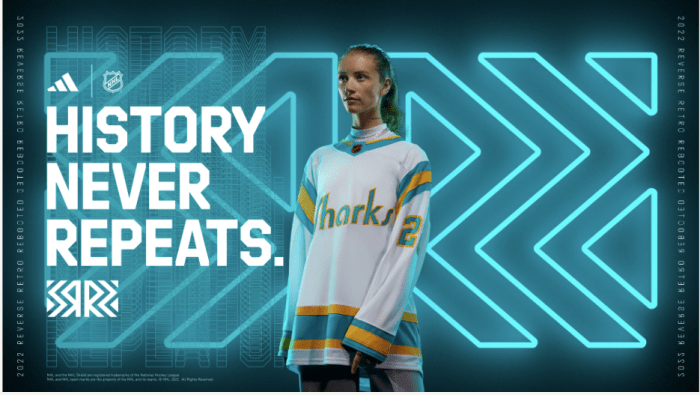
San Jose Sharks
These are so beautiful they make me want to cry.
No team did a better job of incorporating a classic design into the modern day. The California Golden Seals’ overall aesthetic is one of the best in professional sports history — so good that the Sharks just swapped the Seals lettering out for their own and called it a day.
Don’t mess with perfection. The Sharks did it. And they have a timeless classic to show for it.
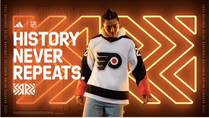
Philadelphia Flyers
Enough said.
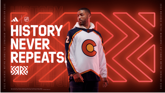
Colorado Avalanche
Anything related to the Colorado Rockies (hockey team) is a win. Their mix of burnt yellow, dark blue, and red is a timeless combination, and the red ‘C’ surrounding a yellow ball makes one think of a sunset dipping below the mountains.
I thought Avalanche nailed it with their first reverse retros by remixing their current colors with the Quebec Nordiques design. These are another home run, and should be popular among fans for years to come.
Good Tier
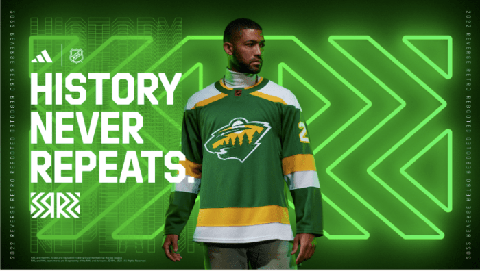
Minnesota Wild
You can’t go wrong with the North Stars.
These are fantastic, pay homage to Minnesota’s hockey roots, and manage to blend the two eras of uniforms together perfectly.
The only thing holding the Wild’s reverse retros back from the elite tier is that we’ve seen a very similar design to this before, docking them a few points for creativity. But out of the “good” category, they’re at the top.
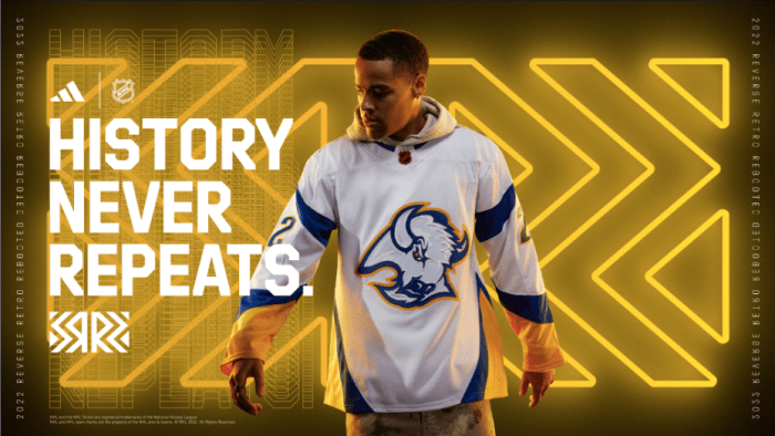
Buffalo Sabres
With the Sabres already bringing back the authentic Goat Head uniform as an official alternate this season, they had to opt for something of a remix on their reverse retros. And, boy, did they nail it.
Of the teams that opted to combine designs from past and present, the Sabres are one of the two (the other being the Wild) that did it best.
With a rich history of fantastic uniforms, along with a few bad ones sprinkled in there, the Sabres toed the line splendidly this year. Great job all around.
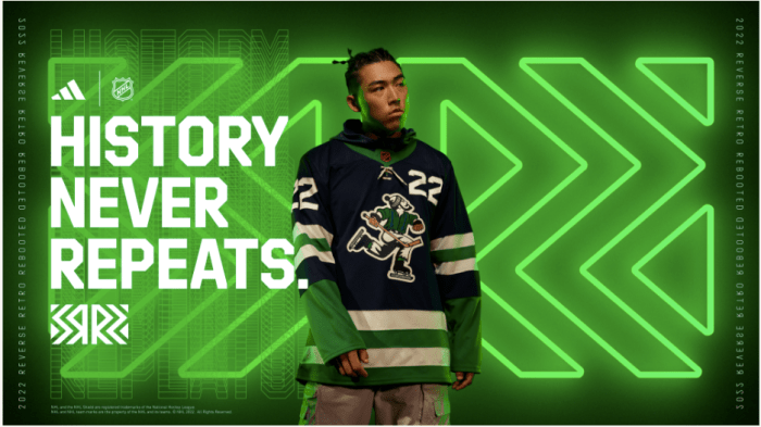
Vancouver Canucks
Take away the number of the front, and these move into the elite tier. That’s how good the Canucks’ reverse retros are.
Things may be a disaster on the ice in Vancouver this year, but at least it’ll be a pretty-looking disaster whenever they don these bad boys.
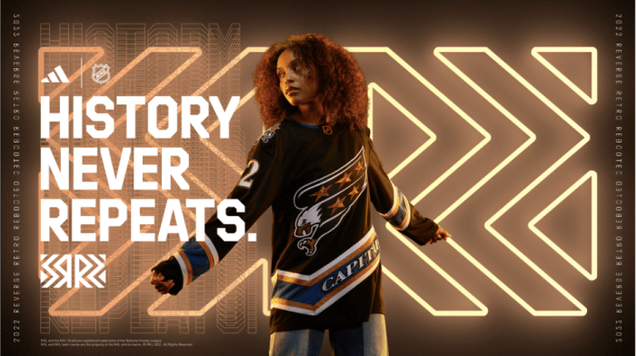
Washington Capitals
Ok, I like these. I want to make that clear. But we seem to have forgotten just how reviled the screaming eagle Capitals jerseys were by the end of their run, eventually leading the team to switch back to its original red-blue-and-white color scheme and receive universal praise for it.
As a retro one-off, though, they are good. Very good, even, paying homage to a very particular era in Capitals history. But it’s not quite enough to bump them up a tier.
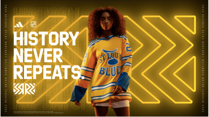
St. Louis Blues
God, these are gorgeous. The Blues’ blue-and-gold palette has always been a favorite of mine, especially when they opt for baby blue over their royal alternative.
These jerseys blend those two colors perfectly, and are really only held back by the weird decision to make the note logo overlap with the letting on the front, creating some unnecessary clutter to what should be a perfect product.
Even still, these are top-of-the-line.
New York Rangers
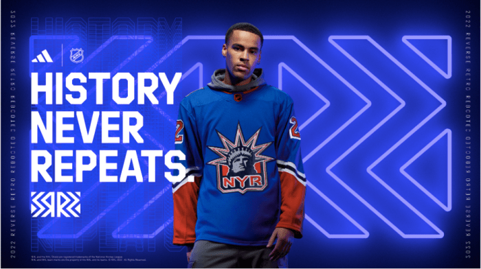
Lady Liberty is an elite logo. When a city has an iconic, world-renowned landmark like the Statue of Liberty, its sports teams should use it to their advantage, helping distinguish them from the rest of the pack.
That’s exactly what the Rangers are doing with their reverse retro here. And while it’s not perfect, it nails the “retro” aspect of the campaign and just elicits good feelings from those who view it. That’s a win in my books!
New Jersey Devils
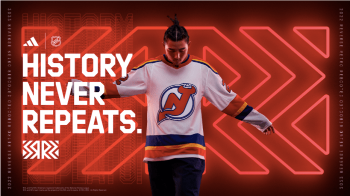
For as nice as this jersey is, it doesn’t measure up to that of the other team diving into its Colorado roots. And, therefore, the Devils are demoted to the “good” tier instead of “elite”.
As with most jerseys in this tier, though, the jersey does succeed in blending a past color scheme with a current logo. It just doesn’t pop as much as others do. But it’s a great effort! And that’s what counts.
New York Islanders
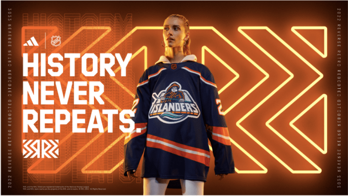
Captain Highliner is the perfect encapsulation of a 1990s hockey jersey. It was a time when teams tried to put a face to their brand in a literal sense via a logo re-design, with the Highliner being arguably the best product of its era.
Finally, the Islanders are bringing him back after years of trying to erase him from memory.
Embrace your goofy side! Have some fun! It’s nice to see this team show some character and bring back a beloved mascot.
Boston Bruins
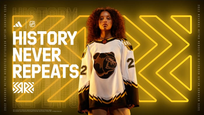
I like how the big, bad Bruins logo is just a funny little guy.
That’s all I have to say, really. They’re great jerseys that make me smile.
Winnipeg Jets
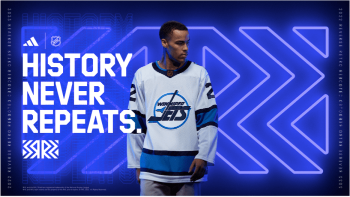
I’ve never understood why the Jets don’t go back to their original logo full-time. This franchise was blessed with one of the best overall design palettes in NHL history during its first stint in Winnipeg, and now that the team has spent over a decade back in its rightful home, the time has come for a rebirth.
Perhaps the reception from fans whenever the Jets trot out their original logo as an alternate jersey will convince the team to finally take the plunge. This year’s iteration is as good as any, held back just a tad by the noted lack of red in the color scheme, resulting in the overall impact of the design being somewhat washed out.
Tampa Bay Lightning
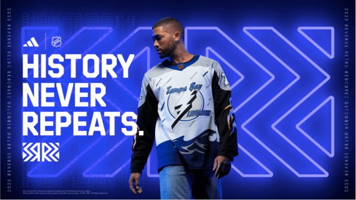
Now, THIS is a retro jersey! The overdramatic storm clouds. The big and pronounced lightning bolt logo with the cheesy surrounding accents, creating the effect of a thunderous clap reverberating from it.
It’s great and just needs a splash of yellow to make it elite.
Vegas Golden Knights
I think I’m the only one who enjoys Vegas’ reverse retros this year, and that’s fine. I’m not afraid to stand on my own. Your hatred nourishes me.
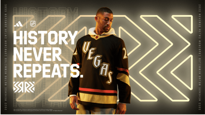
What really makes this design stand out to me is the intent behind it. Apparently, the Golden Knights, with their lack of actual history to draw from, designed this jersey based on how they imagined their uniforms would look if they existed in the 1990s.
And, you know what? They nailed it. This is exactly what the Golden Knights would have debuted as their primary sweaters during that era. It’s like a tacky sign for a dive bar on The Strip.
Bonus points for effort and ingenuity.
Mid Tier
Nashville Predators
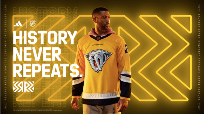
I like the logo. It really does, as the kids say, understand the assignment. But the tiny little “Nashville” lettering above it serves no real purpose, as it’s too small to be seen by fans both in the stands and watching at home, while the rest of the jersey just offers far too much open space.
There’s merit to an uncluttered uniform. But when your logo is a bloodthirsty sabre-tooth tiger and your team name is the Predators, maybe jazz it up a bit.
Edmonton Oilers
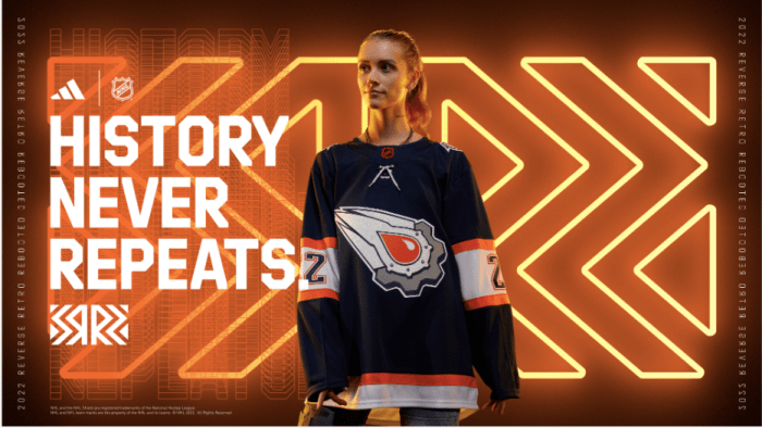
The logo is great. The color scheme is bad. Such is the duality of man.
The Oil Rig era of Oilers jerseys has always been a fun time capsule displaying what teams were going for back in the early 2000s — an era led by “bold” and “sleek” designs that were the preferred target. And as the years have gone by, these jerseys have transcended from a punchline to a legitimately revered relic, so much so that it ultimately led the team to re-adopt it this year.
I want the orange accents to work. I really do. But they don’t, and the jarring way they break up the original flow of the jersey just throws everything off.
Not good, not bad.
Montreal Canadiens
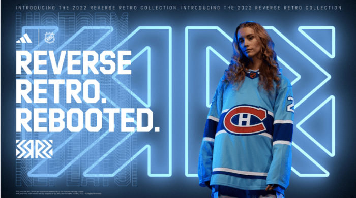
The Expos-inspired color scheme is very cool. With the Canadiens more or less keeping the same overall logo and jersey design throughout their entire existence, retro options are pretty limited.
Still, this just kind of feels boring. And going with blue text on a blue background for the nameplate is going to be a visual nightmare on a broadcast.
The good news is that if people have a hard time seeing the lettering, the Habs can always illuminate it with the fancy little torch they bring out during their opening ceremony.
Arizona Coyotes
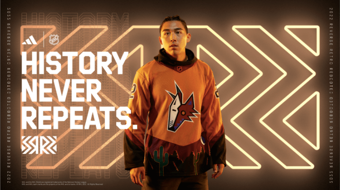
I don’t think these jerseys are good, by any means. But they aren’t the abomination that some are painting them as on Twitter, either.
The Coyotes’ original designs are perhaps the most “1990s” of any NHL team, giving them a leg up on the competition when it comes to retro uniforms. This one is a bit of a mess, though, with the cacti along the bottom adding a Phoenix Suns-style desert vibe to the jersey but is ultimately held back by the weak logo and color scheme.
After going back to the Kachina jerseys full-time, everything else will be unable to match up. That’s certainly the case here, with the Coyotes surprisingly landing in the more apathetic category of uniforms — which is arguably the worst of all.
Bad Tier
Dallas Stars
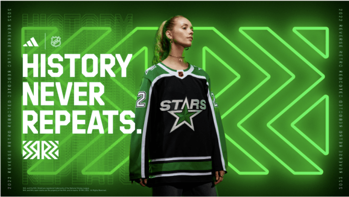
This sure is a jersey!
With the Wild co-opting the North Stars aesthetic for themselves, there were only so many avenues down which the Stars could go for this design. Still, though, this is a pretty bland final product, offering no eye-catching elements aside from some decent little white piping along the collar.
Dallas’ reverse retro is not terrible, but I can’t see anyone rushing out to buy one, either. And that might be worse.
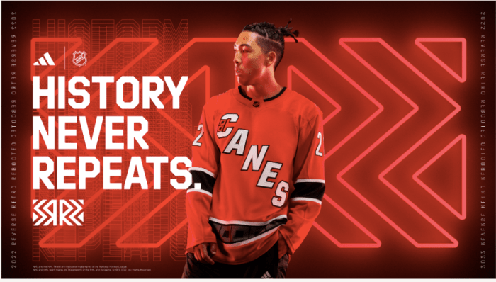
Carolina Hurricanes
If you have access to the Hartford Whalers and their related intellectual property, you should never opt for anything else.
Early leaks seemed to suggest that the Hurricanes were combining the Whalers’ logos with their own red-and-white color scheme, which would have been fantastic. Maybe not as gorgeous as the traditional green-and-white uniforms, but still pretty good!
Instead, we got cheap-looking “CANES” sweaters that are basically a worse version of Carolina’s already-announced alternates paying homage to the franchise’s original design.
Boo!
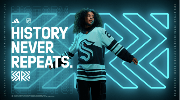
Seattle Kraken
Look, they’ve been an NHL team for less than two seasons, so I can excuse the Kraken for not exactly nailing the whole “retro” assignment here. But even still, this is a pretty middling effort.
Their options might be limited, but they’re not barren. It would’ve been nice if Seattle went for a Supersonics-inspired design to pay homage to the city, like some other teams did. Instead, they just kind of tossed out a remixed version of the only unforms they’ve ever worn.
Cool. Next!
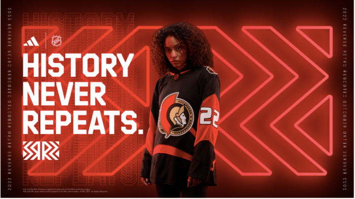
Ottawa Senators
The Senators have history. Sure, they’re an expansion team, but the Senators have been around for longer than you’d think and have shuttled through more jersey designs than pretty much any other NHL team throughout their existence.
And this is what they landed on? A copy-and-paste of their new/old primary logo with some truly horrific style choices made along the sleeves? Come ON.
Take some risks. Have some fun. Instead, the Senators had one foot in the wrong end of each pool, resulting in a jersey that doesn’t know what it wants to be.
Unwearable Tier
Columbus Blue Jackets
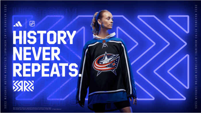
This isn’t a reverse retro jersey. This is an unlicensed bootleg you see for sale at the airport upon arriving in Columbus. They didn’t even change the logo!
The Blue Jackets haven’t been around for very long, so they don’t have a ton of history to draw from when designing any throwbacks. But their old Stinger logo screams “retro”, and would have worked a whole lot better than whatever these monstrosities are.
I just don’t get it. The Blue Jackets added some blue piping to their normal sweaters, doubled down on black, and called it a day.
Calgary Flames
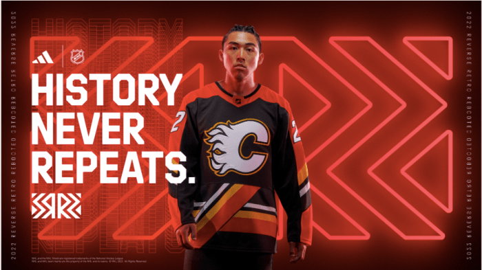
This might be the worst jersey ever made. I’m not kidding.
The consensus worst offenders in NHL history like the Kings’ “Burger King” uniforms or this scrapped Blues’ alternate are at least campy and fun. This just doesn’t make any sense. The “podium” stripe under the Flames logo looks like a design mistake, and completely throws off the flow of the uniform.
The Flames are blessed with a litany of fantastic uniforms that span a number of different color schemes throughout their history. But this is just wrong. Burn it (pun intended).
Detroit Red Wings
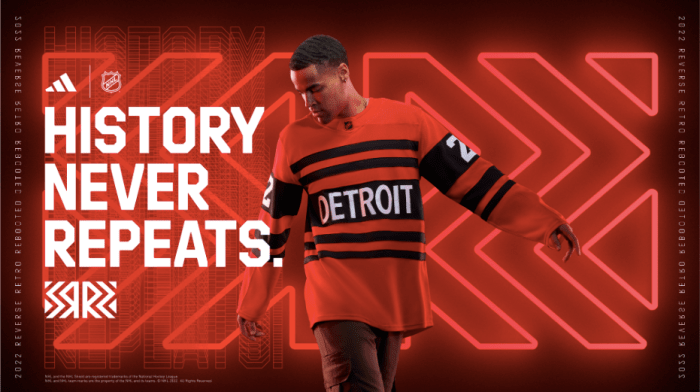
There must be a consensus mandate within the Red Wings organization to punt on reverse retros. That’s the only way to explain the team’s back-to-back abysmal products, with this year’s not even featuring the iconic winged wheel at all.
It’s nice that the Red Wings discovered horizontal lines. And I’m proud of them for that. But this looks like the sweater the opposing team wears in a sports movie that couldn’t afford to get the Red Wings’ jersey rights.
Chicago Blackhawks
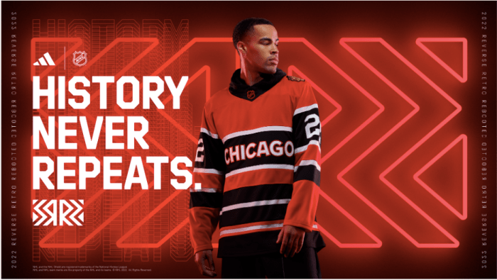
Look, it’s not a racist caricature. So, that’s nice, I guess. Congratulations on clearing the lowest bar imaginable.
Like Detroit, the Blackhawks more or less punted on their design this year. And given how many outdoor games this team has played lately, with each one requiring its own “vintage” alternate, I guess they ran out of ideas.
That’s understandable. But it doesn’t erase just how bad these are. If this was a formal ranking, they’d be last.
